No house is an island…
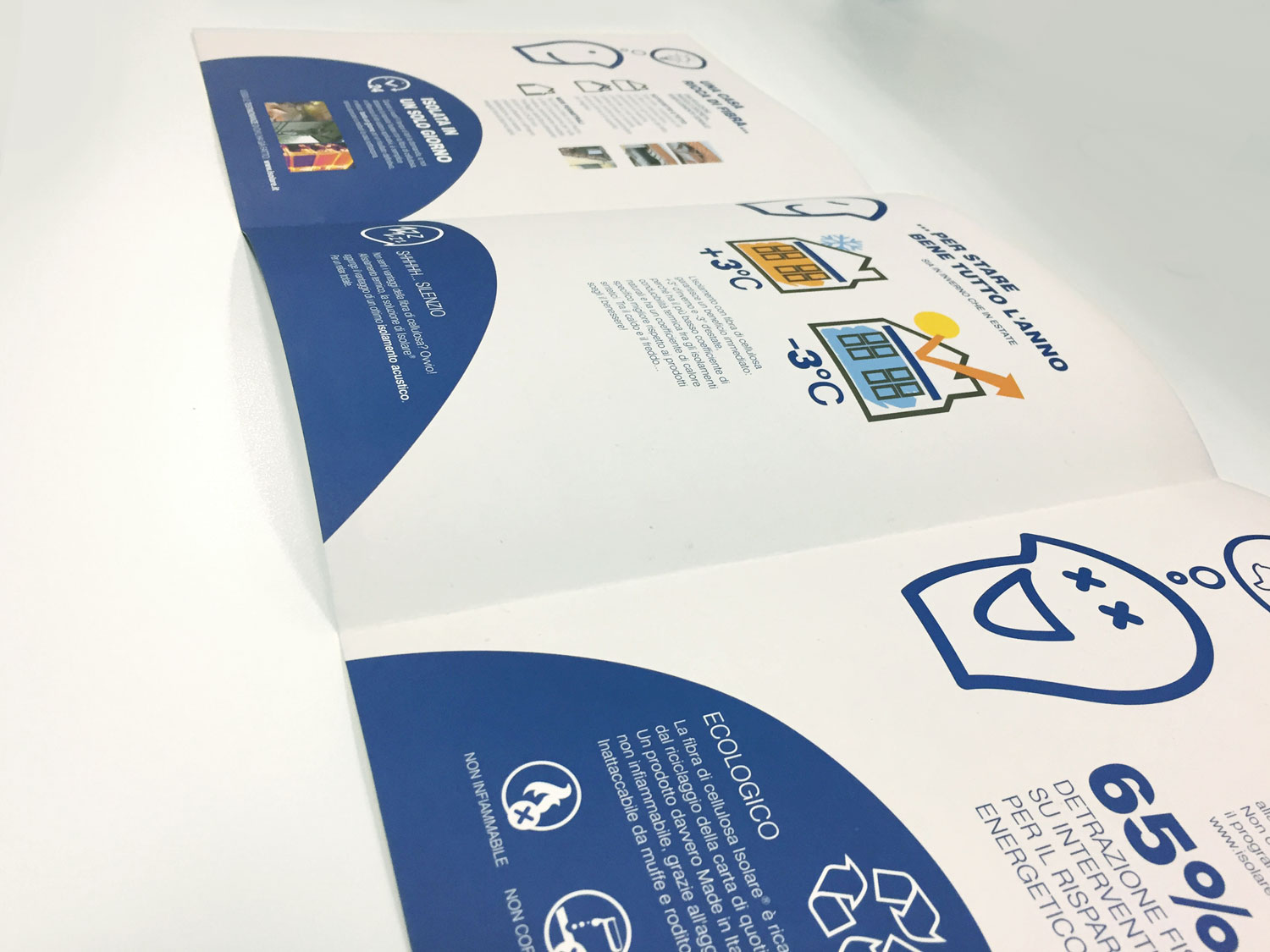
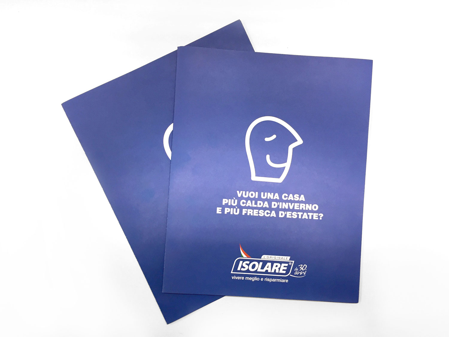
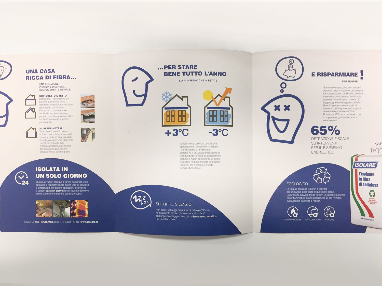
A mission in a name, set out in the clearest possible way. A logo based on simple and immediate elements. Communication potential to be recognised and promoted, because the first step towards creating effective communication is listening to clients and understanding where they want to go. This results in a tagline that sounds like an advertising jingle and a graphic mascot formed by just a few lines, with an ironic and carefree expressivity. All this has led to the creation of a brochure that provides a clear yet fun account of the company’s history and its work, as well as a television advert that speaks directly to everyone, while also featuring a creative touch. There are also coordinating promotional items, flyers and stands, opening the company up to a new style of communication while still respecting its identity.


