A story of solid foundations
The Dart touch
Before, there was a construction company with 50 years’ experience and an array of quality projects completed. Now… the same company still exists, but it has something else up its sleeve. It has the tools it needs to interact with clients, suppliers and everyone who lives and works in and through those projects, in the form of a completely revamped image.
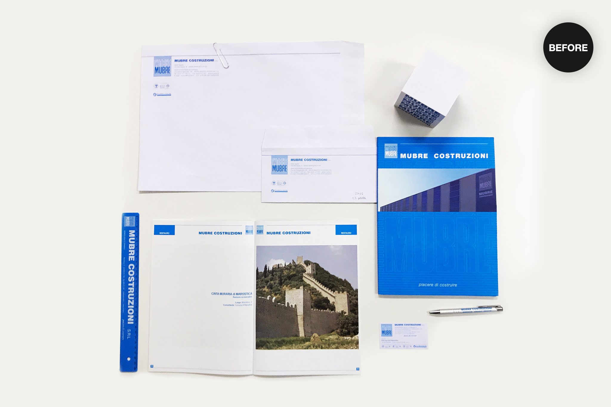
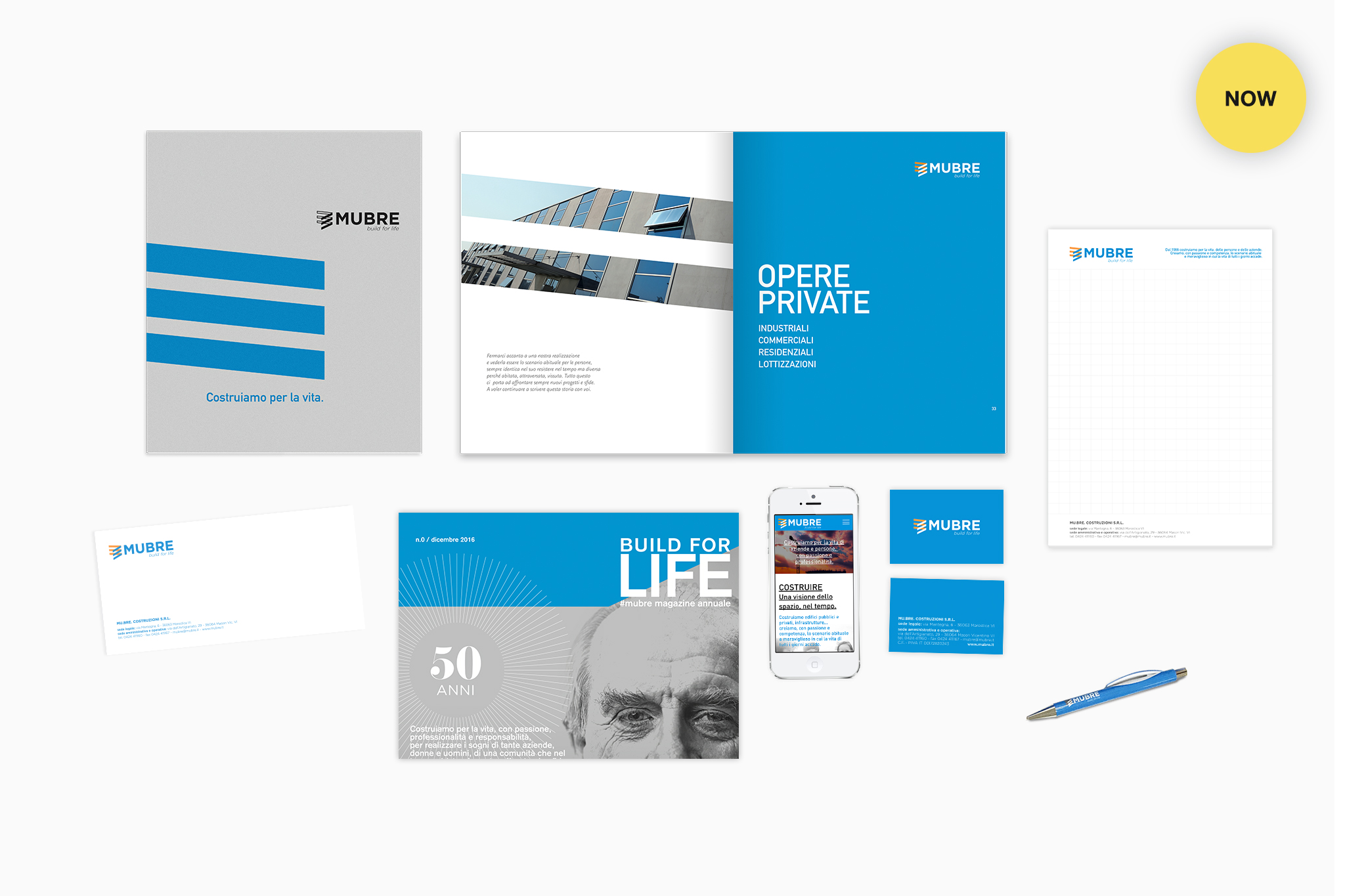
The company undertook a meticulous project of conceptual and graphic analysis in order to facilitate the transition from old to new and optimise the potential for communication with the client, with whom it maintained a close dialogue. It was a well-planned, thorough project, marking half a century of history with an enthusiastic look to the future.
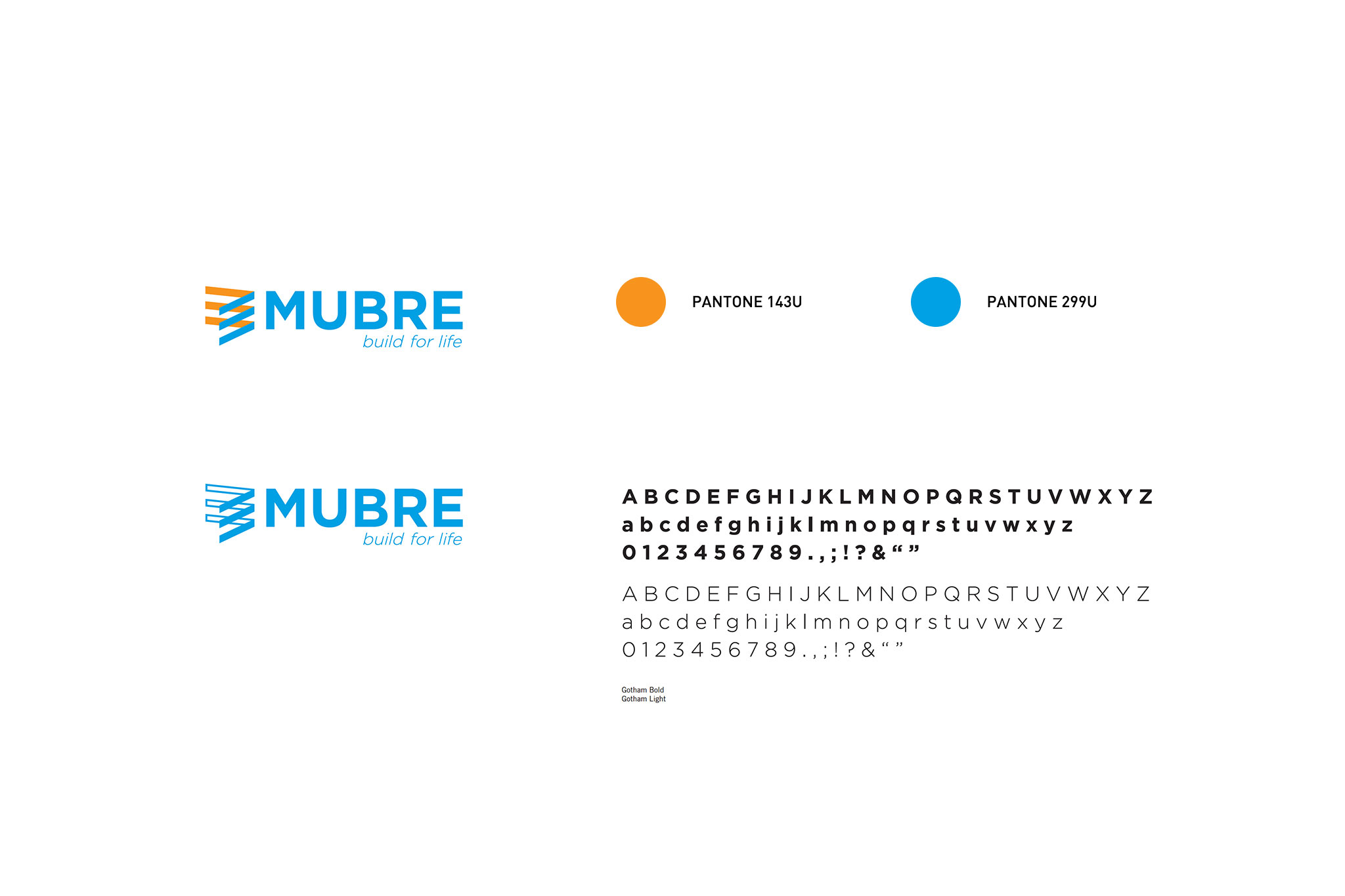
The logo revolves around blue, the company’s historic colour, but incorporates the dynamism of orange in an abstract composition which invokes the lines of a building or structure. The tagline, meanwhile, directly addresses the importance the company places on people’s lives, the environment and its passion for work.
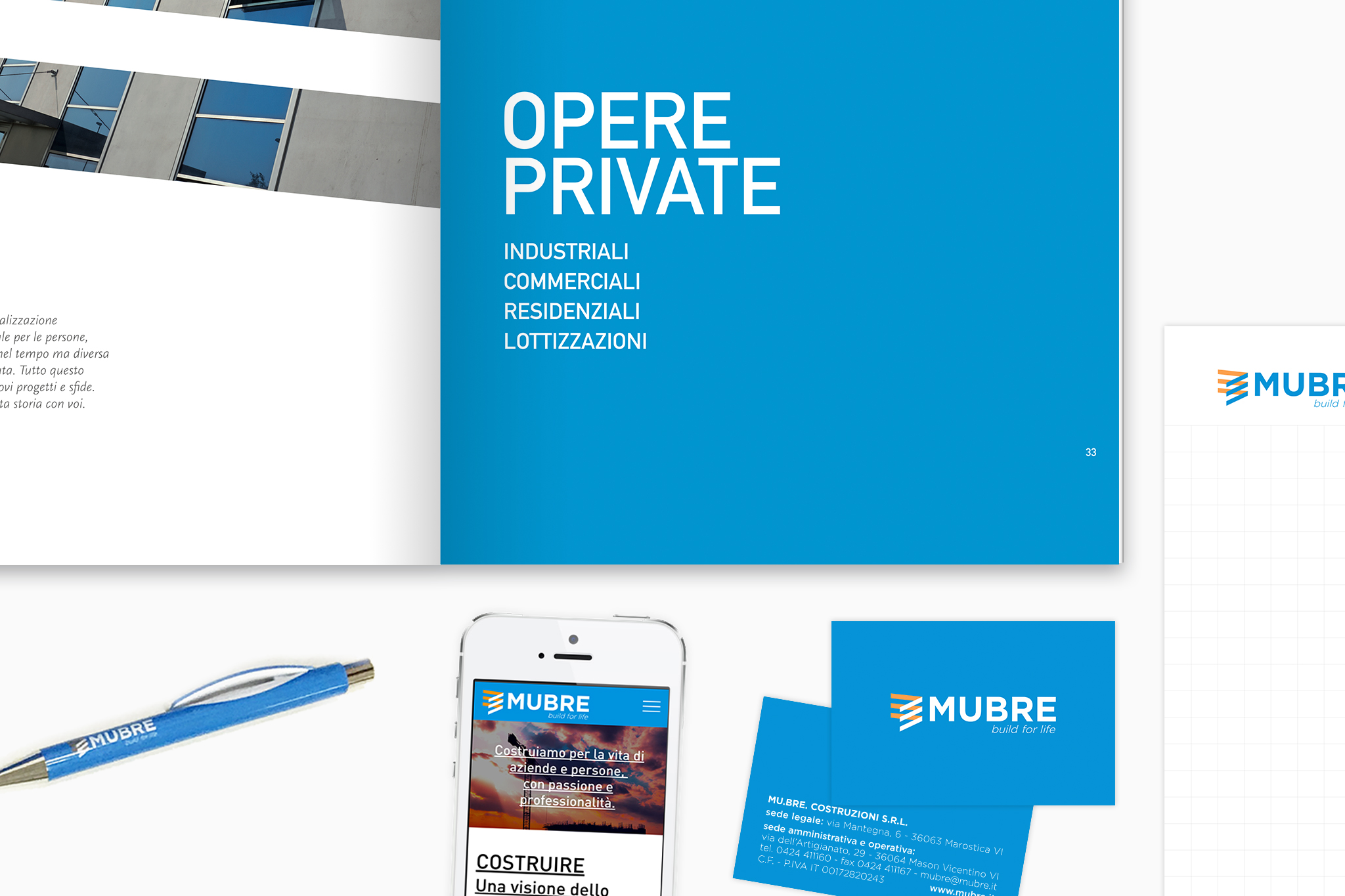
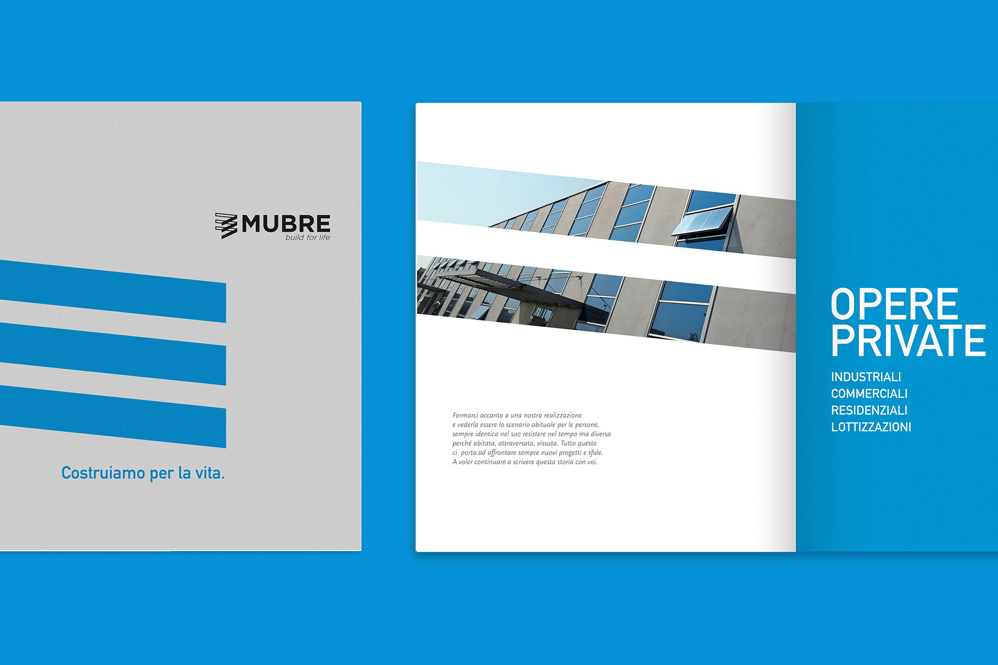
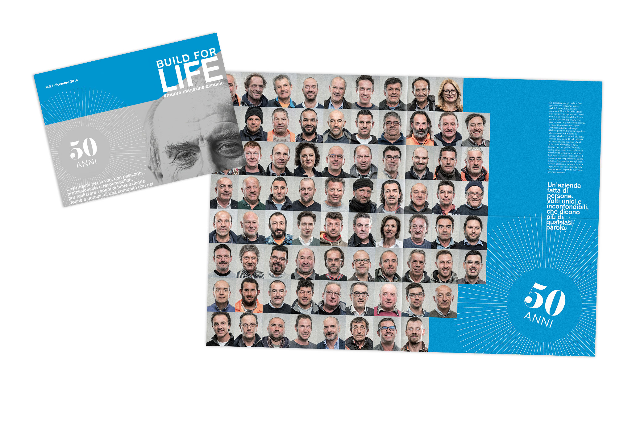
The coherent, coordinated image makes for a company profile which conveys values and statistics with a modern, high-impact graphic style. Meanwhile, the company magazine clearly sets out the organisation’s key values, numbers and projects.
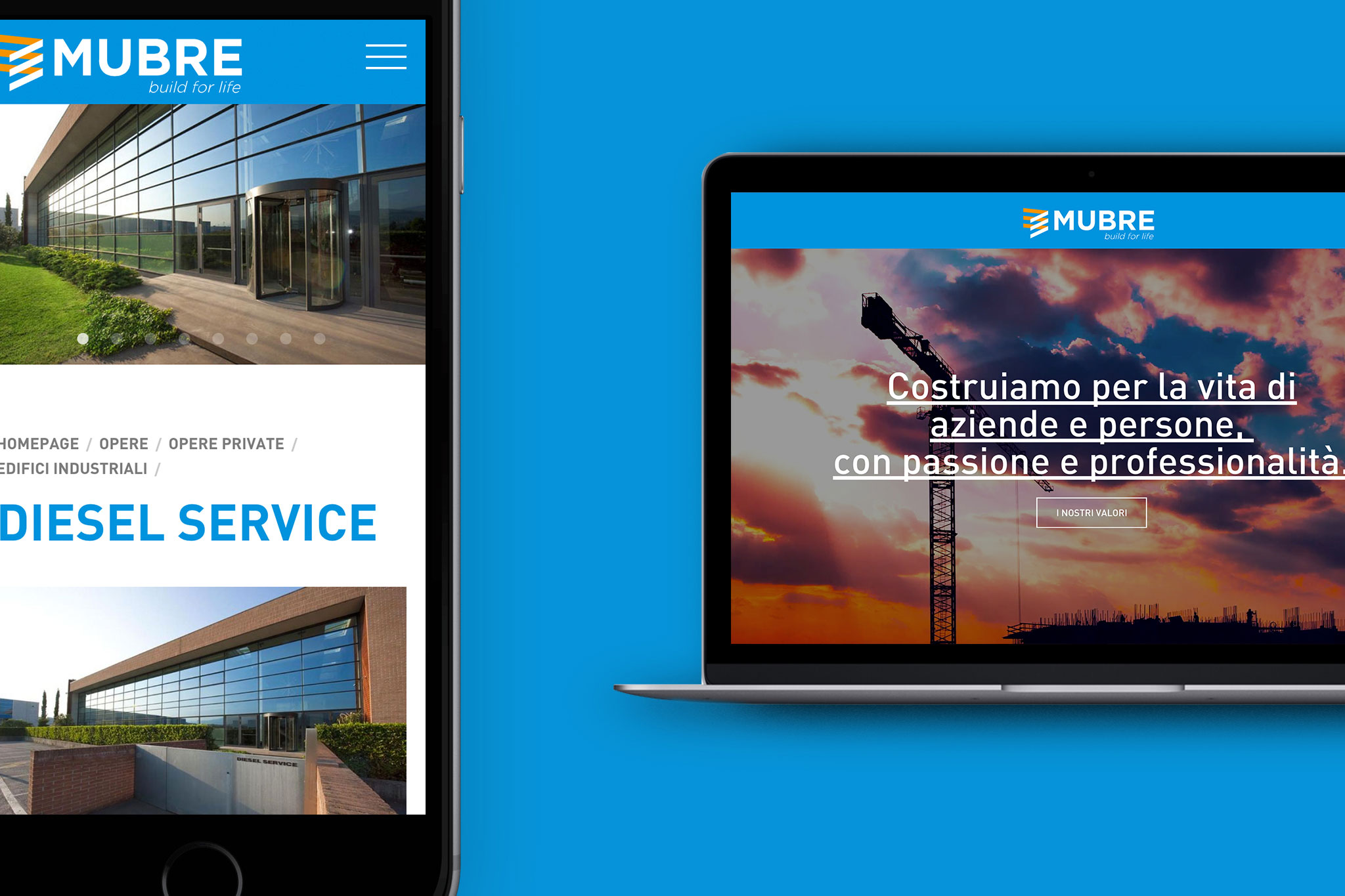
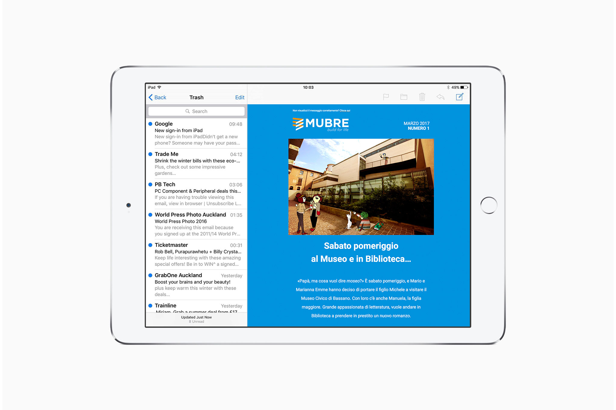
Finally, the company’s online presence has been bolstered with a comprehensive new website which is responsive and easy to browse, while a unique monthly newsletter narrates the day-to-day goings-on of a normal family, using text and illustrated photos which select a different Mubre project as a backdrop for each episode.
